Creating an accessible design means ensuring your content is as consumable as possible for people with blindness, visual impairments, neurodiversity or other issues.
It’s totally understandable that you might be confused by accessibility guidelines at first. Ergo, I recommend you get a head start with an accessible design tool — where you can try out thousands of professionally designed, fully compliant accessible templates.
When accessibility testing, every choice, down to the font you pick, is meaningful.
So, let’s take a look at accessible fonts and how to pick the right ones for your projects.
Click to jump ahead:
- What are accessible fonts?
- What are dyslexia-friendly fonts?
- ADA-compliant font size
- WCAG text size
- Is serif or sans serif better for accessibility?
- Are script fonts bad for accessibility?
- How do I make a font accessible?
- Best fonts for accessibility
What are accessible fonts?
Accessible fonts are fonts that are easy to see, read and understand for all people.
While the need to make your visual content accessible to all focuses largely around those with disabilities, the truth is that accessible fonts apply to everyone. Certain fonts are hard for many people to read, even if they aren’t dealing with an issue like low vision or dyslexia.
Accessible fonts shouldn’t make content more difficult to read, slow the reader down, make it hard to distinguish one letter from another or include unnecessary visual flourishes that detract from the utility of the font.
This infographic uses accessible fonts. The font is legible, has distinct letters and doesn’t contain unnecessary visual clutter that detracts from comprehension.
Related: How to Create Accessible Infographics With Venngage
What are dyslexia-friendly fonts?
Dyslexia is a learning disorder, and also called a reading disability. Dyslexic people have trouble identifying speech sounds and learning how they relate to letters and words, thus having difficulty reading.
This project by Daniel Britton recreates the feeling of reading with dyslexia for a non-dyslexic person:
Companies have created dyslexia-friendly fonts to help dyslexic people read more easily. These fonts often use thicker lines in parts of letters, the letters can be slanted, and letters that have sticks and tails (b, d,and p) vary in length. One example is the Lexend font family (which is available in Venngage!):

Note that researchers haven’t found evidence of dyslexia fonts actually making dyslexic people read faster — however, lots of people with dyslexia like the added features of these fonts and find them helpful.
If you don’t have dyslexia-friendly fonts on your website, use traditional sans serif fonts can work. Research shows that sans serif, monospaced and roman font types increase the reading performance among people with dyslexia, while italic fonts decrease readability.
Some good fonts for people with dyslexia are Helvetica, Courier, Arial, Verdana and CMU (Computer Modern Unicode).
What font size is ADA compliant?
It’s generally best not to go below 12px with 16px as a starting point.
The Americans With Disabilities Act (ADA) prohibits discrimination against those with disabilities, and it imposes certain accessibility requirements on public buildings. And while the ADA does not explicitly spell out font sizes it deems to be compliant, some accepted standards in web design have emerged in recent years to make sure content is accessible for all.
Web Content Accessibility Guidelines (WCAG) recommend making sure that users can zoom in to make text 200% larger, though this recommendation applies to websites and other web design rather than visual communication tools like infographics, reports and brochures.
This event poster template was designed for accessibility—you can tell that none of the text goes below the 12px mark. This is an excellent way to make sure that people with varying levels of visual acuity or disability feel your content was designed for them.
Even in lengthy, multi-page documents, it’s important to maintain minimum readable type sizes with your accessible fonts. If that means you need to add pages in order to get all your content in, Venngage makes it easy to insert new pages and maximize the readability of your material, like in this annual report template.
Related: ADA Standards for Accessible Design: How to Be Compliant
WCAG text size
Web Content Accessibility Guidelines (WCAG) don’t establish a minimum text size, though an informal standard of 16px and no smaller than 12px has emerged in recent years.
Where WCAG does make firm recommendations is ensuring that on websites, it’s possible for users to zoom in by 200% to make text larger.
These guidelines cover far more than font choice or size, including the use of colors, color contrast, the page’s structure and more. All of these factors play into how accessible your design will be.
Related:
- Color Blind Design Guidelines: How to Convey Meaning to Everyone [With Examples & Templates]
- How to Use Color Blind Friendly Palettes to Make Your Charts Accessible
- Image Alt Text: Definition and Best Practices for Accessible Designs
Keeping font sizes large in your accessible visual communications also makes for much more engaging content for all readers, not just those with accessibility issues. Optimizing for accessibility is an excellent way to trim unnecessary words from your content.
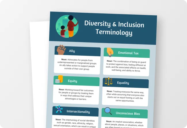
This infographic on designing for diversity is another good example. It uses only sans serif fonts whose font size is large enough that readers don’t have difficulty reading, or even skimming:
As this employee orientation checklist illustrates, it’s possible to use smaller font size for the body text, so long as the fonts are accessible and you apply the principles of accessible design. In this case, color-coding, lines and checkboxes all help readers understand the information flow.
You’ll also notice that this template uses a sans serif font for both its heading and body text, as sans serif typefaces are generally easier to read:
Similarly, this orientation checklist uses an understated background and multi-shade color palette while remaining approachable and accessible for all.
Is serif or sans serif fonts better for accessibility?
If you still confuse serif and sans serif fonts, here’s a quick tip: sans serif are the ones without the little “serifs”— the embellishments at the top and bottom of letters (hence the “sans” in its name):

Because serif fonts include additional flourishes, depending on the type’s size, these fonts can be difficult to read. Letters may run together, even touching each other in smaller sizes. For this reason, serif fonts are more commonly used for headings due to the larger font size, like in this template:
Did you know serif fonts are predicted to be one of the graphic design trends for 2022? Check it out: 8 Graphic Design Trends that Will Define 2022
That doesn’t necessarily mean that all sans serif fonts are accessible. As they don’t have the decorative strokes, some sans serif typefaces can have characters that look really familiar, making it difficult to read.
Here are a few tips for picking the best font for your visual communications. Keep these in mind when selecting an accessible font, whether you choose a serif or sans serif.
Are script fonts bad for accessibility?
Script fonts can be difficult for individuals with dyslexia, low vision or other impairments to read because by their nature, the letters are not distinct from each other. Script fonts are designed to emulate the appearance of cursive handwriting, in which letters are all connected to one another.
How do I make a font accessible?
You can’t change a font’s properties, but increasing text size can often help make a font accessible. By making the text itself larger, it’s sometimes possible to make the letters appear more distinct from one another, which is important in choosing accessible fonts.
Also, as we’ve touched on already, the fonts themselves are only part of the equation. How information is presented can also add to or detract from how accessible the design is. Here are a few tips for making visual content accessible:
- Use short simple sentences and bulleted lists (like this one)
- Use simple-to-understand icons
- Avoid unnecessary visual clutter like complex backgrounds or clashing color palettes
- Avoid small type
- Organize information into sections with large, easily readable headings
It’s generally best when designing for accessibility to limit yourself to just one font, or at least as few fonts as possible. That way, readers who have trouble with text will easily be able to process your information without having to think about what the letters look like. But that doesn’t mean your design has to be boring; use the example above as inspiration.
Here’s another example. This infographic illustrates how the design itself can enhance accessibility by using clear icons and a color scheme that represents the key points of the information.
If your design calls for information to run in vertical rather than horizontal sections, consider adding lines (as this example does) or other dividers to make it easy for readers to understand where related information stops.
Creating content for your social media posts? Here’s an example of how you can use simple icons to illustrate your Instagram carousel content while still ensuring you’re using accessible fonts.
Best fonts for accessibility
Though plenty of accessible design details are in how fonts are used, there are a few common fonts that will work with a wide range of design types while still being appropriate for accessibility concerns, including serif and sans serif options.
Our favorites are fonts like Helvetica, Calibri, Arial, Times New Roman, Tahoma, Museo Slab, Source Sans Pro, Rockwell and Roboto Slab. An important aspect to picking accessible fonts is avoiding ones with misleading shapes, or characters that could be mistaken for others (uppercase I, number 1 and lowercase L, for instance).
As this post illustrates, there are many hugely popular fonts, including Google Fonts, that can help you ensure your designs are accessible to all. When designing for accessibility, it may be best to avoid fonts like Raleway. Though it’s beautiful, its distinctive look can actually make it tougher to read. For example, the font uses a W in which the tip of the center of the letter overlaps. Especially in small applications, this detracts from easy readability.
Related: 20+ Best Google Font Pairs for 2021 [FREE DOWNLOAD]
If you’ll be using data or financial information in your accessible designs, such as for presentations or annual reports, it’s a good idea to pull key points out and display them in large, visually pleasing ways like in this example.
When using icons for your accessible designs, they should remain on the simpler side rather than being highly detailed. Often, these details can become a distraction for readers, and if your audience has impairments that make it difficult for them to process visual materials, they may be turned off.
Make sure you design for accessibility, diversity and inclusion by choosing an accessible font
Whether you’re creating content for your website or visual communication materials, it’s important to keep your audience in mind. And that means choosing accessible fonts anyone can read.
With Venngage, accessible design is simple. We create templates that are accessible and easy to edit, with all end users in mind. So, even if you’re a non-designer, you can create visual materials that speak to everyone. Plus, it’s free to get started.


